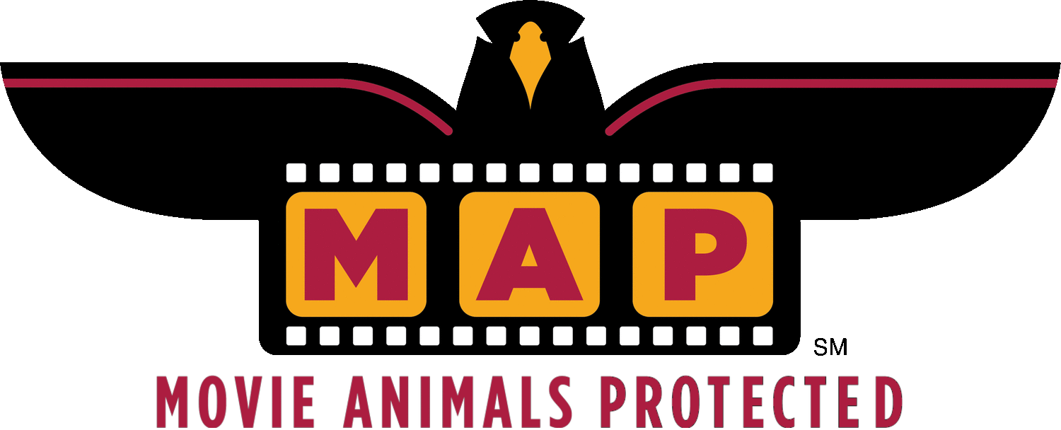
THE STORY Of OUR LOGO
Choosing a logo that stood out was a priority for us. We knew it had to be different, not only to create a brand and set itself apart but to reflect our personality. After exhaustive brainstorming, we finally had our “ta-dah” moment: the hawk! This badass bird of prey not only symbolizes the power of observation but also exudes strength, guardianship, and a commitment to truth.
Graphic artist Carol Frank turned this concept into a logo that we love. The MAP logo captures the essence of who we are and what we do.
Movie Animals Protected (MAP) service mark indicates producers followed humane filming practices when working with animals in filmed media.